
If you want to create really good charts quickly and easily, …
Who can’t see the layout monotony from PowerPoint or Keynote anymore …
Those who place high demands on the informative value of their charts …
… will not get past the Datawrapper will not get past.
Rarely have I really seen such a great tool for great presentation graphics.
Examples:
-

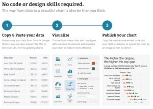
Infographic showing a 3-step process: 1) Copy & paste your data, 2) Visualize with customizable Sparkpoint charts, and 3) Publish your chart. Includes a sample comparing U.S. education levels—ideal for Präsentationstraining für Führungskräfte. Sparkpoint Executive Coaching.
-

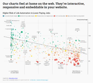
Scatterplot showing risk of job automation versus annual wage for various occupations, with colored dots by education level. Lower-paying jobs show higher automation risk. Perfect for Sparkpoint sessions like Präsentationstraining für Führungskräfte. Trend line slopes downward. Sparkpoint Executive Coaching.
-

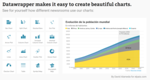
Screenshot of Sparkpoint’s Datawrapper chart options on the left and a sample area chart on the right showing world population growth by continent from 1950 to 2100; ideal for Präsentationstraining für Führungskräfte, with color-coded chart areas by continent. Sparkpoint Executive Coaching.
Recent Comments